In economic terms this can be represented as a graph, with two lines; one for the way demand emerges and one for the way supply emerges. The demand line shows the way demand will manifest; the usual pattern is that as the price of a good increases less people will want to buy it, this decrease the demand (Gillespie, 2010). If shown on a graph, the line representing the demand will show that when the price is high there will only be a low quality of goods demanded, but as the price decreases the quantity that people want to buy will increase. The line representing supply will show the opposite; when the price for a particular good is low the suppliers are less likely to be attracted to selling that good compared to when the price is high and there is an increased potential for a...
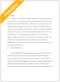
If the two lines are placed on a graph they will intersect, the point at which they intersect is the point of equilibrium, where the supply equals the demand. This is shown in figure 1. Point 'P', where the lines cross is the point of equilibrium and indicates the price.
Figure 1; Supply and demand graph showing the point of equilibrium
The angle of the lines will vary depending on the goods, as the rate at which the supply or demand will change will vary on the nature of the product. Where there are essential goods such as gasoline or electrify the rate of change is likely to be more gradual compared to non-essential goods such as champagne.
The point of equilibrium will change depending on market conditions. Where